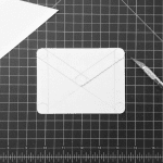
There are studies that can make your icon, letters, or anything related in this topic such as logos. Google helps me as a designer to grasp fundamentals. I love the Google apps designs for applications, I like to express the g-mail design on its simplicity but impactful mark. They take a four step process on achieving their final design. Google designers made a physical prototype where they will get the inital study for the concept of the app. Following with the shadow theory of the the icon applied from a forty five angle at the top left. When the correct shadow is applied the icon is then translated to a graphic to have a vectorized image to alter with color and elements.
At the end of the day it may sound like it is simple, but takes time and effort to polish a logo/icon for any website design we make at Gibson Design.
As for typography, there is a difference and I’ll call them in this journal serifs and scripts. We will compare the Arial-serif vs Anisha-script fonts. As you can see from the harmony of the fonts it creates an effect of the message. I went with a strong color for the serif font to create vision and impact for the reader. While the script font breaks the block-formal feeling of the serif to provide a fun and appealing combination.
There are other ways to harmony for text as we do in color. It is difficult to play around text to make an impact and call to the reader. Google fonts is a good way to start and play around with standard serift/script fonts. They are used universally on web, mobile, and print.
At Gibson Design, we tread lightly for the perfect vision for our clients because we love to have a product to showcase not only us but the business. Little niches like these make the product attract the audience and creating a connection to the target. Breaking apart the project and other elements can bring new ideas to the table. These icons can be transferred over web design, websites, print, social media, and other brand marketing.


